Five ways to butcher your infographic
Pic: Chris Isherwood
By Jordan Yates
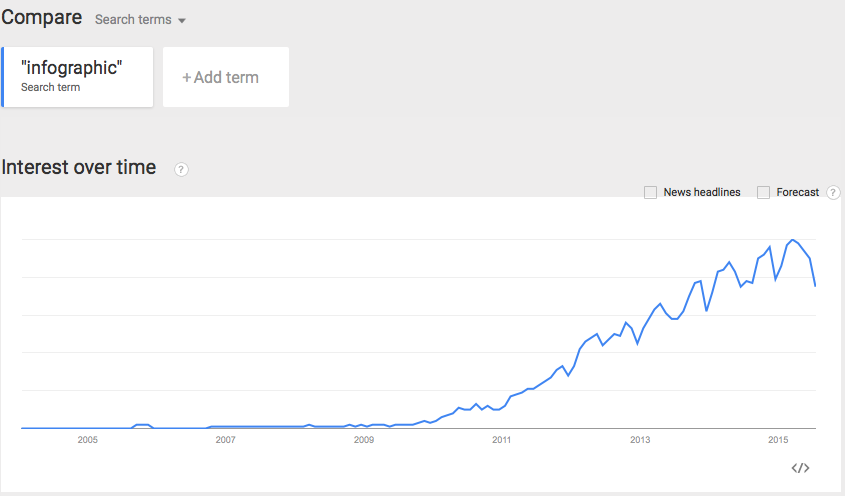
Since 2007, Google Trends has reported a massive upsurge in the interest in infographics.
Some are even claiming the increase in infographic use to be as high as 9,900% over the last eight years.
With all that competition, it’s never been more important to make sure every infographic you produce is the best it can be.
Here are five common mistakes that leave infographics floundering:
1. Your message isn’t strong enough
Infographics are made up of two elements – the visual and the content – and both need to be excellent. If your content’s weak, it doesn’t matter how strong the design is.
Your content has to be bold, engaging and perfect for your target audience.
If it’s anything other than excellent, it will get lost in the sea of infographics.
2. You’ve got a messy layout or – worse – no narrative
A typical infographic reads from left to right and follows the rules of a normal page, with content flowing from top to bottom.
You can occasionally break the rules, but don’t go too far.
If it’s a complete and utter mess, the typography’s all over the place and the colours are garish, then your infographic will be ruined – regardless of its content.
Equally, the story must be compelling.
Even the best design in the world won’t save you if your narrative is messy, unstructured or simply doesn’t exist.
3. You haven’t translated words into images
Don’t fall into the trap of making an infographic that isn’t visual enough.
The idea of an infographic is to take the facts and figures – the story you want to tell – and make it so visually appealing that it gets sucked into your reader’s brain.
The content should help the design, not hinder it.
4. It’s not a showstopper
Infographics need to be loud and bold. They need to stand out – but so many of them are tame.
They don’t want to stand out; they don’t want to shout.
For example, an infographic on fish is typically going to be blue because it wants to match the sea.
But a different colour would help it stand out against the thousands of other fish infographics.
You’ve got to really stand out. Use bright colours, engaging graphics and bold headlines.
The headline has to reel you in.
It’s like a good book; if the front cover doesn’t pull you in, you won’t read the rest.
5. It’s overly branded
This is tricky.
There’s a fine line between fully branded infographics and editorial infographics that might include a subtle logo.
Branded infographics should contain topics relevant to the brand itself, like brand history or something about what the brand does.
But anything that isn’t to do with your brand should be an editorial infographic in which your logo features, but it’s not massively branded. Some of the best infographics are done this way.
Try not to ruin an editorial infographic by insisting on having your branding dominating things.
Further reading
Five steps on the path to infographic brilliance.
Yes! Get My Four Free Ebooks Now…

Get 123 pages of expert advice straight to your inbox.
-
Apps (46)
Content Marketing (67)
Digital PR (1)
Integrated Marketing (3)
Multi Screen (12)
News (99)
PPC (2)
Search (120)
Tecmark (70)
Uncategorized (2)

About the Author